Blog
How to Choose the Right Wood Tone for a Warm and Balanced Living Room

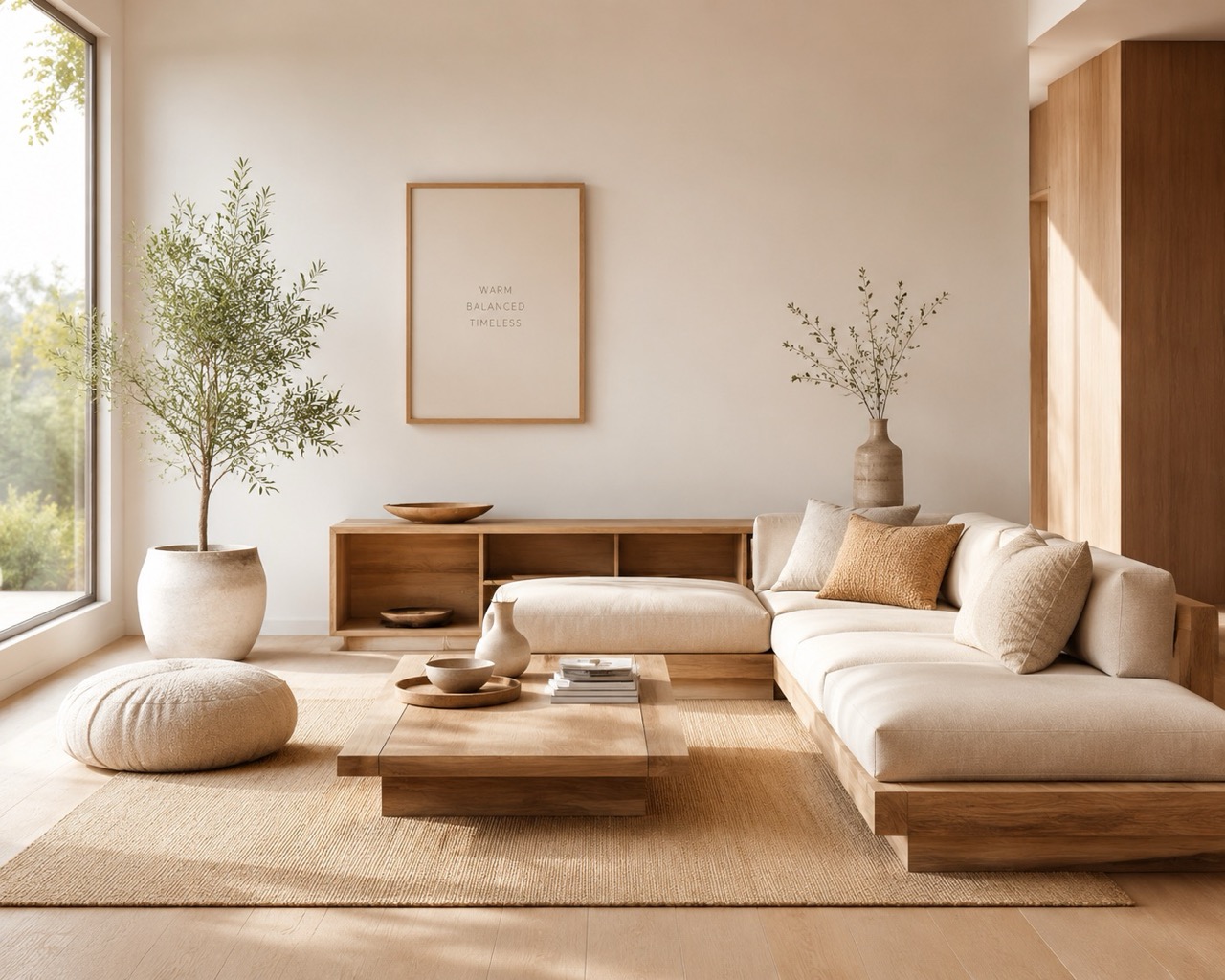
Wood has a strong influence on how a living room feels, even when it is not the most visually dominant material in the space. A timber frame, coffee table, shelving unit, sideboard, sofa base, or exposed floor can quietly determine whether a room feels warm and inviting, clean and contemporary, or heavy and visually crowded.
The difficulty is that choosing a wood tone is rarely as simple as deciding between “light” and “dark.” The result depends on natural light, flooring, wall colour, upholstery, room size, existing furniture, and even the undertones within the wood itself.
A balanced room does not necessarily require every wooden element to match. In fact, carefully combining different finishes often creates a more natural and lived-in interior. The goal is to understand which tones should lead the room, which can provide contrast, and how surrounding materials can help everything feel connected.
Start With the Fixed Elements in the Room
Before choosing a new wooden piece of furniture, look at the surfaces that are already difficult or expensive to change.
Flooring is usually the most important starting point. Built-in cabinetry, doors, exposed beams, wall panelling, and large shelving systems can also establish a visual direction that new furniture needs to acknowledge.
This does not mean your furniture must exactly match the floor. Matching every timber surface too closely can actually flatten the room and make it feel overly coordinated.
Instead, identify three characteristics of the existing wood:
- Is it light, medium, or dark?
- Does it lean warm, cool, or neutral?
- Is the grain subtle or visually pronounced?
A honey-toned oak floor, for example, already adds warmth. Introducing furniture in exactly the same shade may create a large uninterrupted field of similar colour. A slightly deeper walnut or a lighter natural oak can give the room more dimension while still feeling related.
Greyed or cool-toned timber works differently. Pairing it with strongly orange or reddish wood may create an abrupt contrast unless the rest of the palette intentionally connects those colours.
Think in terms of visual relationships rather than exact matches.
Understand Warm, Cool, and Neutral Wood Undertones
Two pieces of wood can appear equally dark but still clash because their undertones are different.
Warm woods often contain hints of:
- yellow
- honey
- orange
- red
- golden brown
Common examples include warm oak, cherry, teak, and some walnut finishes.
Cooler wood finishes may contain:
- grey
- taupe
- muted brown
- slightly ashy undertones
Natural oak can sit somewhere in the middle depending on the finish.
The safest approach is not always to use woods from exactly the same undertone family. Instead, look at whether the tones share enough visual warmth to belong together.
For instance, a natural oak coffee table can sit comfortably beside darker walnut furniture because both retain an earthy warmth. A heavily orange-stained pine piece beside a grey-washed oak floor may require more careful styling.
Textiles can help bridge the difference.
A rug containing tan, beige, brown, cream, or muted rust can visually connect several wood finishes that might otherwise feel unrelated. Cushions and upholstery can perform the same role.
This is particularly useful in relaxed seating arrangements where timber frames, low tables, cushions, and soft furnishings are seen together rather than as isolated objects.
Consider How Much Natural Light the Room Receives
Wood tone should respond to the amount and quality of light in the room.
A large, bright living room can usually accommodate deeper woods without feeling enclosed. Walnut, smoked oak, dark teak, or rich brown finishes can create grounding and contrast against pale walls and soft upholstery.
Small rooms or living spaces with limited daylight need more care.
Using dark flooring, dark wooden furniture, heavy curtains, and deep upholstery simultaneously can absorb too much light. The room may feel visually compressed even if the actual furniture footprint is reasonable.
Lighter woods can help maintain visual openness because they reflect more light and create less contrast against neutral walls.
However, that does not mean small rooms must contain only pale wood.
A darker wooden side table or compact frame can add definition without overwhelming the space. The key is controlling how much visual weight is concentrated in one area.
A useful rule is to let either the floor or the major furniture pieces provide the strongest wood tone rather than making every large surface equally dark.
For example, a room with darker timber flooring may feel more balanced with:
- pale upholstery
- medium or light wood furniture
- a lighter rug
- restrained darker accents
Meanwhile, a room with pale flooring can support deeper wooden furniture without becoming visually heavy.
Match the Wood Tone to the Mood You Want
Wood colour influences atmosphere almost as much as wall paint.
Light Wood for an Airier, Softer Look
Natural oak, ash, beech, and pale timber finishes tend to make interiors feel relaxed and visually light.
They work especially well in rooms built around:
- cream and beige fabrics
- soft greys
- linen textures
- woven materials
- muted greens
- off-white walls
Light wood also suits low-profile furniture because it prevents large horizontal pieces from feeling visually bulky.
A low wooden seating frame paired with neutral cushions, for example, can create a calm lounge-like atmosphere without dominating the room.
Click here for wooden sofas: sofasia.com/wooden-sofas
This approach works particularly well in smaller apartments, reading areas, casual family rooms, and interiors where the goal is softness rather than strong contrast.
Medium Wood for Flexibility
Medium wood tones are among the easiest to combine with changing interiors.
Warm oak, medium walnut, and natural brown finishes have enough colour to give furniture presence without becoming too visually dominant.
They work well with both warm and cool neutral palettes and are particularly practical if you regularly change rugs, cushions, or decorative accessories.
Medium tones are also useful in multifunctional living rooms because they tend to sit comfortably between casual and formal styling.
Dark Wood for Depth and Structure
Dark walnut, espresso finishes, and smoked woods introduce visual weight.
Used selectively, they can give a living room structure and make pale upholstery appear brighter by contrast.
Problems usually appear when dark wood is repeated too heavily.
A dark floor combined with a dark media unit, dark shelving, dark sofa structure, and dark coffee table can make even a large room feel dense.
If you prefer darker timber, introduce lighter materials nearby.
Cream cushions, natural linen, pale stone, lighter rugs, and warm off-white walls prevent the wood from becoming visually overwhelming.
You Do Not Need to Match Every Wood Finish
One of the most common decorating mistakes is assuming every wooden item in a room should be the same colour.
Perfectly matched furniture sets can look orderly, but they can also make a room feel staged rather than naturally assembled.
Most comfortable interiors contain some variation.
A useful strategy is to choose one dominant wood tone and one supporting tone.
For example:
- light oak floor + medium walnut furniture
- medium oak furniture + darker accent table
- walnut seating frame + pale oak shelving
- neutral timber flooring + warm mid-tone accessories
If you introduce a third wood tone, keep it relatively minor.
Small stools, decorative trays, picture frames, lamp bases, and side tables can carry secondary tones without making the room feel fragmented.
Repeating a wood finish at least twice can also make the choice feel intentional.
A walnut side table may look disconnected on its own. If the same tone appears again in a lamp base or shelving detail, the room starts to feel more coherent.
The objective is not identical colour. It is visual rhythm.
Balance Wood With Upholstery and Soft Textures
Wood rarely appears alone in a living room. Its effect changes dramatically depending on the materials beside it.
This is particularly important in homes where seating is low, cushion-heavy, or designed around relaxed lounging.
Wood provides structure. Upholstery softens it.
A darker timber frame paired with dense dark upholstery can feel formal or heavy. The same wood combined with cream, sand, oatmeal, or muted beige cushions feels considerably warmer and more approachable.
Similarly, pale wood beside very cool grey fabric can sometimes feel flat. Introducing textured cushions, woven rugs, or warmer neutral tones helps restore depth.
Click here for seat cushion: sofasia.com/seat-cushions
Rather than selecting timber independently, place wood and textile samples beside each other whenever possible.
Consider how they look under the actual lighting conditions in the room. Artificial lighting can change the appearance of both fabric and wood, particularly in the evening.
Warm bulbs intensify golden and reddish undertones. Cool lighting can make some brown woods appear greyer.
If most of your time in the living room is spent after sunset, evaluate the combination under evening lighting rather than relying only on daylight.
Think About Interior Style Without Becoming Too Formulaic
Different wood tones naturally support different design directions, but these are guidelines rather than strict rules.
Modern interiors often use light or medium woods with clean grain patterns and minimal ornamentation. Natural oak works particularly well because it introduces warmth without disrupting a restrained palette.
Traditional spaces can comfortably support deeper woods, especially alongside patterned textiles, warm rugs, decorative cushions, and richer colours.
Majlis-inspired or oriental interiors often benefit from medium and dark woods because the visual weight complements layered fabrics, low seating, and patterned elements.
That does not mean the room has to feel dark.
A darker timber base beneath lighter seating cushions can create a strong, grounded composition while still feeling open.
Similarly, Scandinavian-influenced rooms often favour pale woods, but introducing one medium or dark wooden piece can stop the space from feeling overly washed out.
The most convincing interiors usually contain some contrast.
Avoid These Common Wood-Tone Mistakes
A few mistakes account for most rooms that feel visually mismatched.
Matching the Floor Too Precisely
Furniture that closely matches the flooring can disappear into it.
Slight contrast usually looks more deliberate.
If your floor is pale oak, consider furniture that is either slightly lighter, warmer, or darker rather than trying to find an exact replica.
Mixing Too Many Strong Undertones
Variation is useful, but combining orange pine, grey oak, red cherry, and dark walnut in equal amounts can make the room feel visually unsettled.
Choose a dominant undertone family and let other tones play a supporting role.
Choosing Wood Without Considering Fabric
A timber sample may look attractive by itself but behave very differently beside your sofa upholstery.
Always evaluate wood alongside the largest nearby textile surfaces.
Using Too Much Dark Wood in a Small Room
Dark timber is not automatically unsuitable for smaller interiors. The problem is repetition.
One darker piece can create contrast. Several large dark surfaces can reduce the sense of openness.
Ignoring the Grain
Colour is only part of the visual effect.
Strong grain patterns attract attention and add movement. If the room already contains patterned rugs, textured cushions, artwork, and decorative surfaces, a heavily figured wood may create too much visual activity.
Quieter grain patterns can provide a useful counterbalance.
Choose for Long-Term Flexibility, Not Just the Current Trend
Large wooden furniture pieces often remain in a home much longer than cushions, rugs, curtains, or wall colours.
That makes adaptability important.
Highly fashionable stains can date more quickly than natural-looking finishes. Extremely grey wood, heavily distressed surfaces, or strongly coloured stains may restrict future decorating choices.
Natural light oak, warm medium oak, and balanced walnut tones generally provide more flexibility because they work with a wider range of textiles and colour palettes.
If you enjoy changing the mood of your living room seasonally, neutral timber becomes particularly useful.
Cream cushions can be replaced with terracotta, olive, navy, or patterned textiles without requiring the wooden furniture to change.
This is also worth considering when selecting permanent seating structures or furniture intended for long-term everyday use.
A visually adaptable wood finish allows the room to evolve around it.
A Simple Way to Make the Final Decision
Before committing to a wood tone, evaluate it against the room as a whole rather than viewing the piece in isolation.
Ask yourself:
- Does the wood complement the floor without disappearing into it?
- Does its undertone work with the main fabrics?
- Is there enough contrast to give the room depth?
- Will the finish make the room feel lighter or heavier?
- Does the grain compete with other patterns?
- Can the wood work with future colour changes?
- Is the finish practical for everyday use?
Then look at the balance of materials.
If the room already contains many hard surfaces, warmer timber and soft upholstery can make it feel more inviting. If the room is dominated by soft fabrics and pale colours, a stronger wood tone can provide useful definition.
The most successful living rooms rarely rely on a single colour or material. They feel balanced because each surface supports the others.
Choosing the right wood tone is therefore less about finding the “correct” shade and more about understanding relationships: between light and dark, warm and cool, soft and structured, permanent and easily changed.
Once those relationships are considered together, wood becomes more than a furniture finish. It becomes one of the elements that quietly holds the entire room together.